In today’s business world, the democratization of data is critical to building data literacy and overcoming the roadblocks that often prevent organizations from seeing tangible value from their data. This means it's increasingly important for business users who aren’t analysts to begin exploring the basics of data analysis and visualization.
Data visualization is the cornerstone of building data analytics capabilities for faster, more accurate decision-making and enhanced forecasting. If you are primarily a dashboard consumer rather than creator and a frequent data analyst, this data visualization primer is for you.
What are visual data analytics tools?
Right now, visualizations are such a powerful tool that there are a multitude of tools available. Tableau and Power BI are two of the top tools, as you can see from the word cloud below – but there are many more:
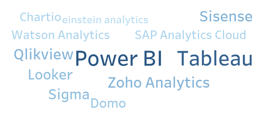
Regardless of the tool chosen, our common goal is to help users understand and gain insights from the massive quantities of data available in our world today.
Why do we use visual data analytics tools?
Visualizations of data allow us to immediately interpret information in what’s called the “pre-attentive” stage. Pre-attentive processing refers to the body’s processing of sensory information – in this case, visual stimuli – that occurs before the conscious mind begins to pay attention.
In other words, it’s your ability to interpret a visual faster than your conscious mind can focus on it, within a fraction of a second. This can create an immediate sense of recognition and understanding, which pulls the audience in to pay closer attention to the data and begin asking questions about what they’re seeing.
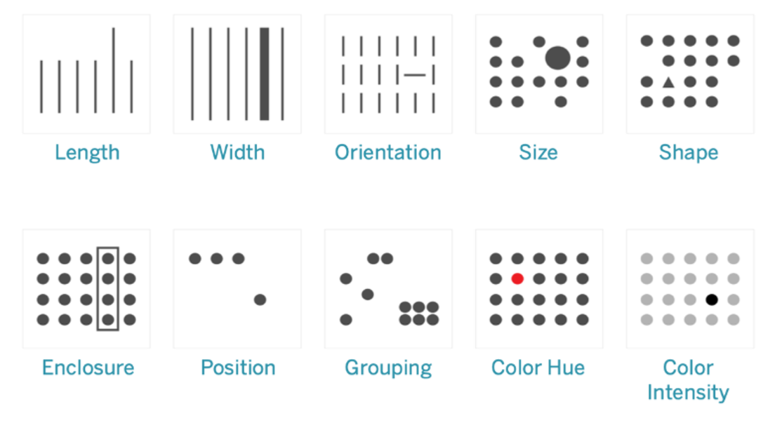
Good visualizations don’t force you to read. Reading is attentive and requires focus. The goal is to immediately focus the audience’s attention on what’s important. Below are some examples of visuals that work well for this:
In addition to fostering greater understanding of the data, when an organization embraces data visualization and begins building their data literacy, they can reap benefits like:
- Improved decision-making quality
- Enhanced planning and forecasting
- Consistent data across the enterprise (single source of truth guiding the business)
- Increased speed, simplicity, and ease of using data
- Increased operational efficiency
How do we get started with visual data analytics?
Visual data analytics starts like anything else in life. It starts with asking questions. Your audience has questions, and you have tons of data to answer those questions. The key is presenting that data so that people will easily understand and interpret it.
You need to get to know your audience. Is it executives or middle management? Executives may want to see just KPIs for the areas they oversee. Mid-level managers may want more detail, like why a KPI was missed, or why things are trending a certain way. Also consider whether the public will have access to this visualization.
How does your audience prefer to consume their data? Often when a new dashboard is released, the audience hasn’t been consulted or had a chance to offer insight into how they want their data presented. Dashboard and visualization creators should always consult with their audience, considering details like whether they need a colorblind-safe color palette, or whether users want to log in to the dashboard on their computer or get a subscription email at the same time every day. Do they need to see it on a phone?
How will the audience interact with the visualization? It’s important to allow users to do self-service analytics. It’s great to present a dashboard with a lot of information, but if the audience can’t drill down or filter it the way they want, or use parameters, they won’t be able to independently answer any questions they have about the data or spend time truly analyzing it.
I prefer to create visualizations that are completely driven by customizable parameters. The audience can choose what goes on the x and y axes, changing the orientation of the charts, what the aggregations will be, color palettes, sizes, marks, what type of chart will be created, etc. They have total control over their analytical environment. Different people have different learning styles.
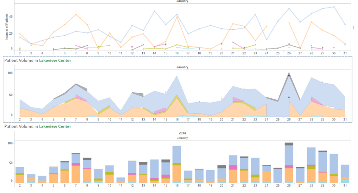
Consider the three charts below. They all present the same information in different ways, and each one is preferred by different people.
How do we use visualizations to answer questions?
Here are a few ways that we can design dashboards that quickly answer questions.
This is a sample done by Microsoft in Power BI of demographic data for cancer:
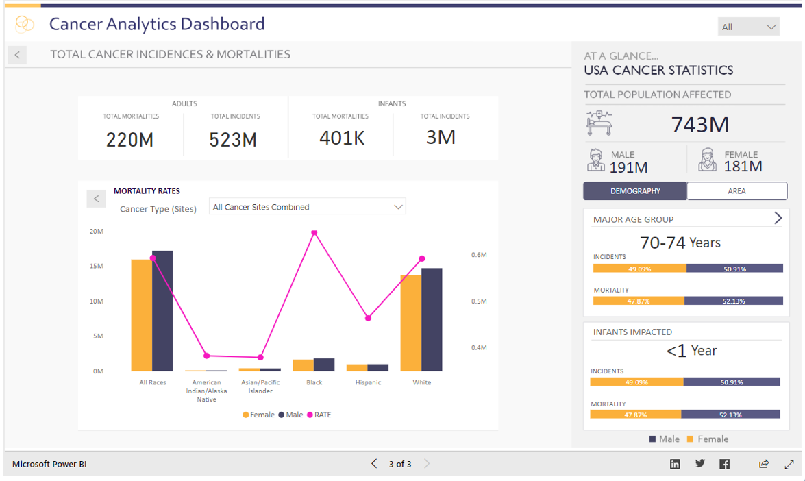
The large numbers at the top are popular with executives who want quick KPIs. Below that, you’ll find more detail for managers who want more detail. This dashboard is also interactive and filterable to see the data in other ways in the sidebar.
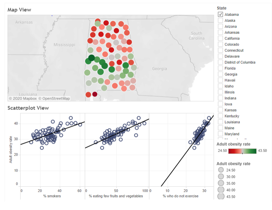
When we use color, there should always be meaning behind it. For example, this heat map with scatter plots:
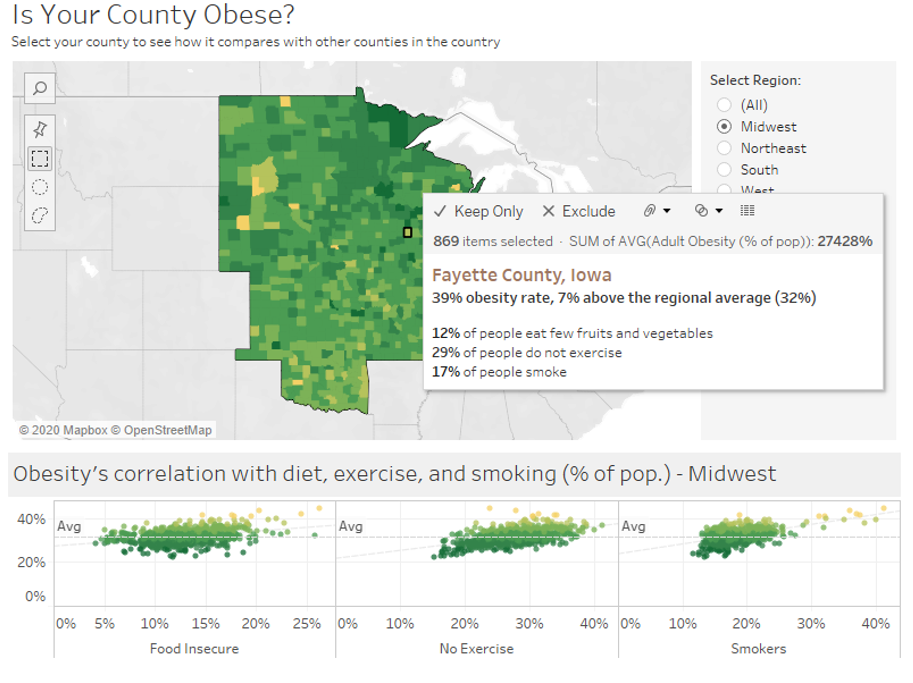
You can see how the various gradations in color can help you to quickly interpret obesity rates across the region.
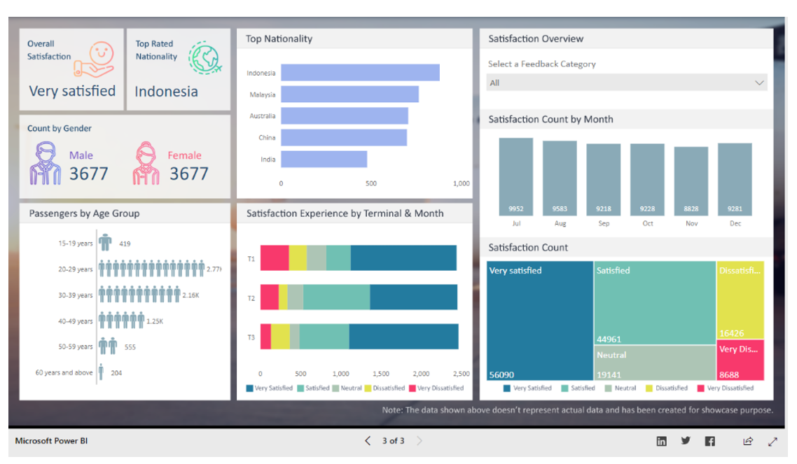
In this population sentiment study, or survey, again the big ideas are presented at the top left, with further detail included and colors to aid in interpretation.
Another useful option is a non-standard diagram, like this:
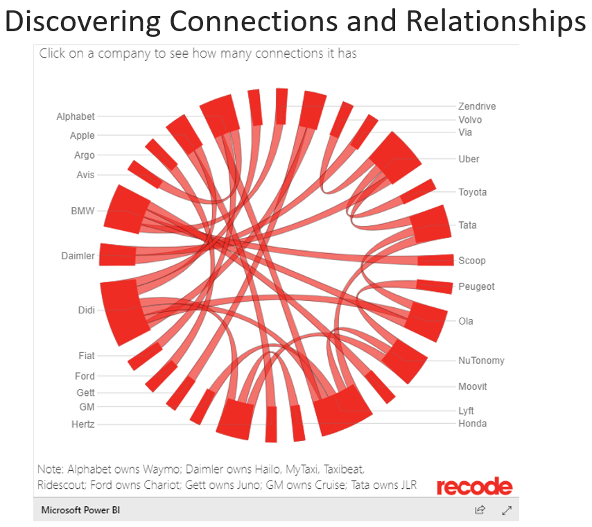
In this Chord Chart, everyone is trying to create a self-driving car, and most of those companies are related, like the agreement between Alphabet and Honda. This type of visualization allows the audience to see connections between things much more quickly and clearly than raw data allows.
What are some visual data analytics best practices?
As mentioned earlier, it is critical to build in interactivity that allows the audience to engage with the data independently and get answers to their questions right there inside the dashboard.
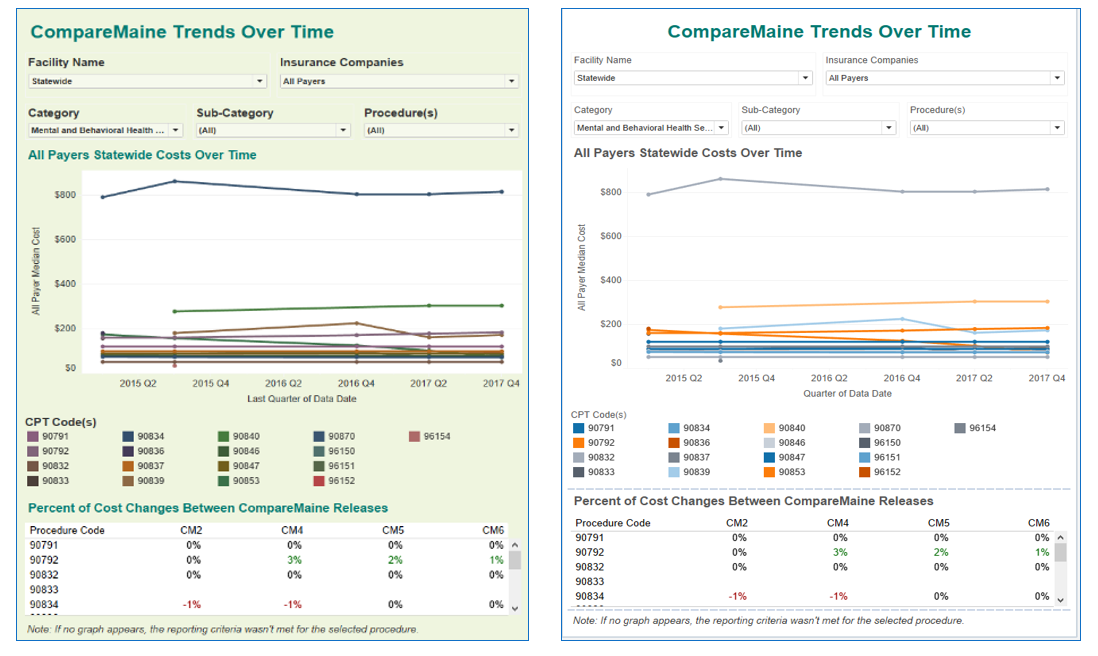
Another previously mentioned topic, color, is a core tool for creating great visualizations. Take a look at the before and after dashboards below. The green background taints the ability to clearly perceive the other colors, so we remove that. We also switch to a colorblind-safe palette, otherwise a large chunk of the audience may get nothing out of the visualization. This dashboard could use a little more work, but at least the use of color has been improved.
A couple more tips on color: solid black letters on a white background are too harsh. Unless your visualization will be displayed on a projector, a very dark grey is easier on the audience’s eyes. Black on red, or red on black, is a complete no-go – it can look three-dimensional and actually disorient the viewer.
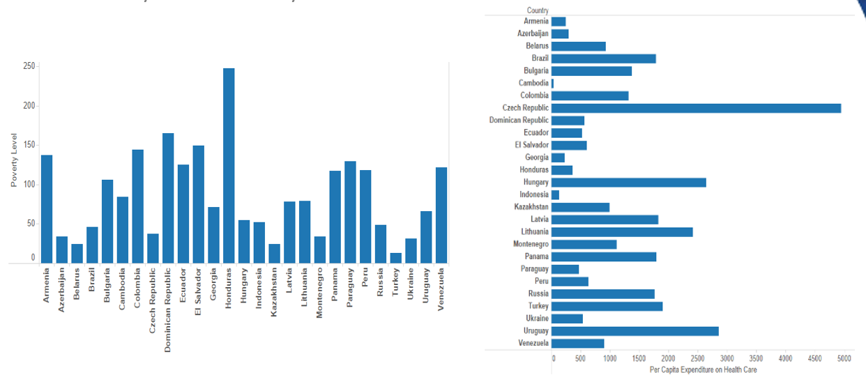
Bar charts are popular and valuable, but when the labels are vertical you force the audience to spend time tilting their head to read them. This is especially difficult when there are many labels and the font is small – remember, different people have differently sized monitors or could be using a tablet or small laptop. You can easily solve this problem by switching the axes around so it’s more legible:
Your audience should be able to read the visualization in seconds. Take a look at the examples below – can you understand the meaning of the graph at the top left at a glance? Do you know intuitively who is meeting their quota and who isn’t?
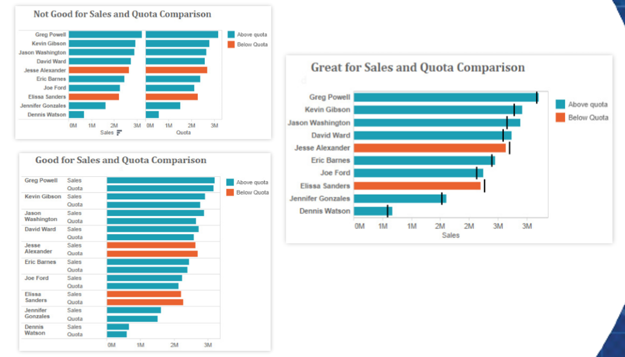
Probably not. The graph below it is much better for understanding quickly who is meeting or below the quota, but the one on the right is the best example. Not only can you quickly understand where there maybe issues meeting quotas, but you can also see how big the gap is. The use of both the reference lines and color alert you to possible problems.
Avoid overloaded views like the one below:
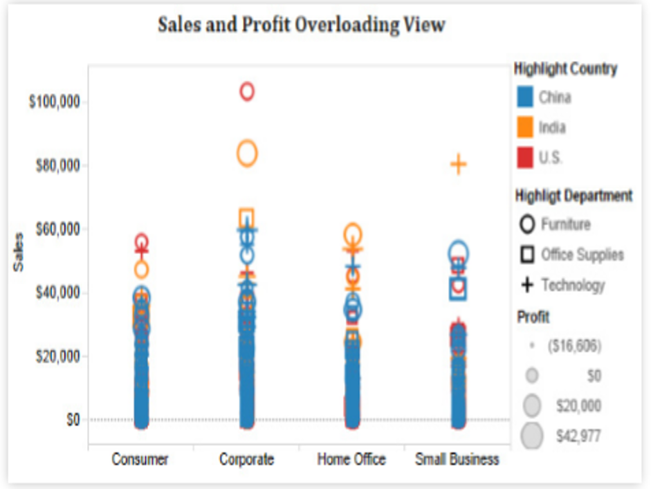
Color is used decently here, with different shapes for different categories, but the sizing differences get lost because so much is crammed onto the screen – it’s impossible to see the separation between the symbols and it almost creates a bar chart result.
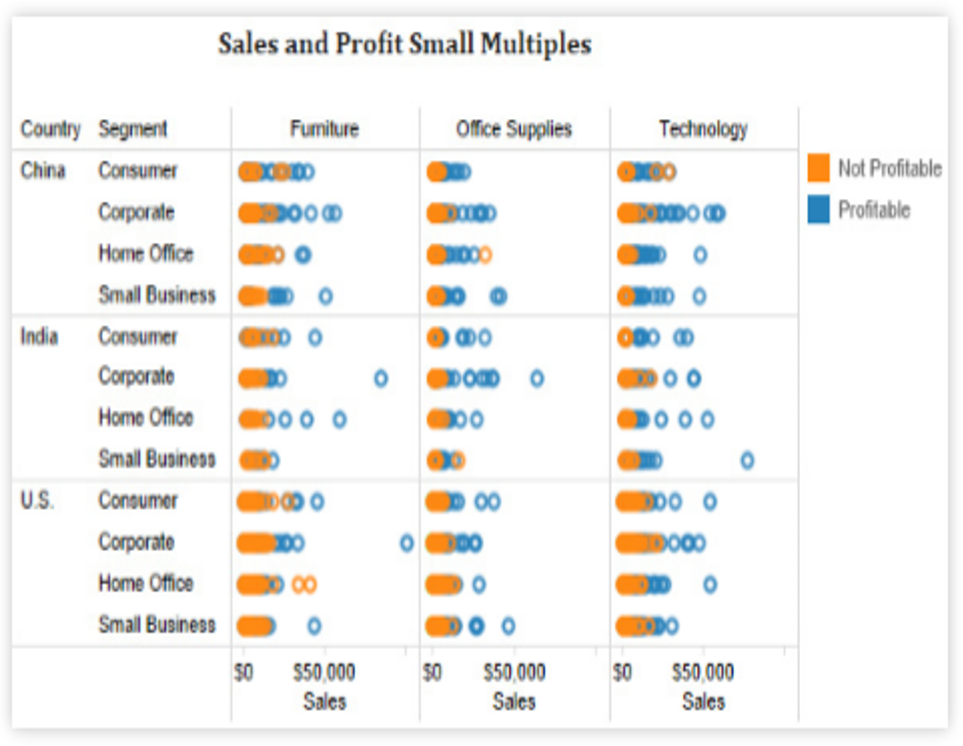
We can make this better by using small multiples, or individual little charts together, which do a better job of describing what’s going on. This isn’t perfect, but it’s much better:
How do we put it all together to create holistic dashboards?
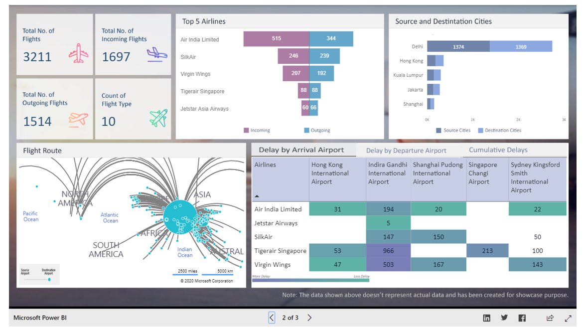
Here is a metrics board for a fictitious airport. It shows how many flights they have, how many are on time, how many are outgoing and incoming, etc. It does a good job of using color, though it should be more colorblind-safe. The only problem with this dashboard is that it lacks interactivity. It’s just a snapshot of what’s going on, with no way to investigate further and ask questions. This might work well for a public-facing use, but doesn’t really empower a business audience to learn much.
Coming back to the heat map example we used above to talk about color, mapping is an excellent tool if your data has geographic elements. You can show so much data with it, and allow your audience to gain a lot of understanding from it. Especially if the area you’re presenting the data for is the area in which they live and interact. It makes it more personal and grabs their attention.

This map is helpful because it’s very interactive, allowing the user to choose which region of the country to look at, and then drill down within that region to a particular state and county.
This visualization takes a look at a healthcare practice’s data, showing how many patients are coming in on a particular day at a particular time. When the line goes above 70 into the yellow, that means they are extremely busy.
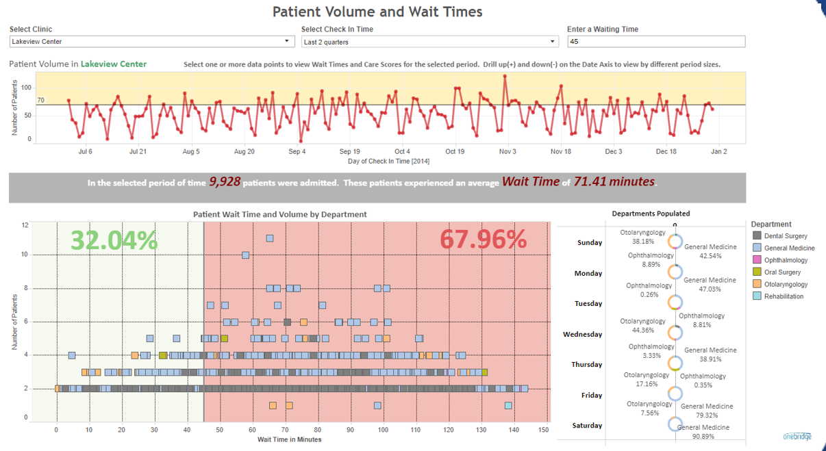
Below that, you can see what percentage of patients were seen within a set goal. The audience can set parameters for waiting time. At the current parameter setting, this shows that only 32% of patients were seen within 45 minutes. As we know, long wait times lead to bad customer experience, so this can alert the practice to a problem area they can address to improve patient satisfaction with their services. Plus, this visualization is fully interactive, allowing the audience to also filter by department, facility, multi-select certain hours and days, and compare previous quarters/half-years/years. It’s a true tool for the practice to use to answer questions and make discoveries.
Need a little practice?
Take a look at the visualization below and make a list of ways to improve it using what you’ve learned in the guide above. You can access the visualization here.
What should you do next?
Now that you’ve dipped your toes into the water with visual data analytics, take your knowledge a step further:
- Attend a Tableau or Power BI Users Group meeting
- Organize a quarterly data Show and Tell event at your organization, demonstrating ways that data is helping the business achieve its goals
- Search the web for data visualization blogs – there are very talented experts out there willing to share what they’ve learned
- Watch YouTube video tutorials for the tool you’ve chosen – most are free, but some can also prepare you for certification exams
- Contact us for help. Our experts can work with you to create powerful visualizations for your users


